Raymii.org

אֶשָּׂא עֵינַי אֶל־הֶהָרִים מֵאַיִן יָבֹא עֶזְרִֽי׃Home | About | All pages | Cluster Status | RSS Feed
Site updates, new font for better contrast and other small CSS fixes
Published: 12-01-2021 | Author: Remy van Elst | Text only version of this article
❗ This post is over four years old. It may no longer be up to date. Opinions may have changed.
Table of Contents
A small site update
New year, time for some site updates. This site is generated with my self-written open source static site generator named ingsoc (named after 1984) and this update is a collection of small improvements. A new font, internal code updates to the generator and a few CSS fixes here and there.
I sometimes write updates on new changes in ingsoc, those articles can be found here. The last site update was about the costs to run Raymii.org. If you read these site update articles, please let me know. I'd like to hear your opinion on the new layout.
New font: Ubuntu instead of Raleway
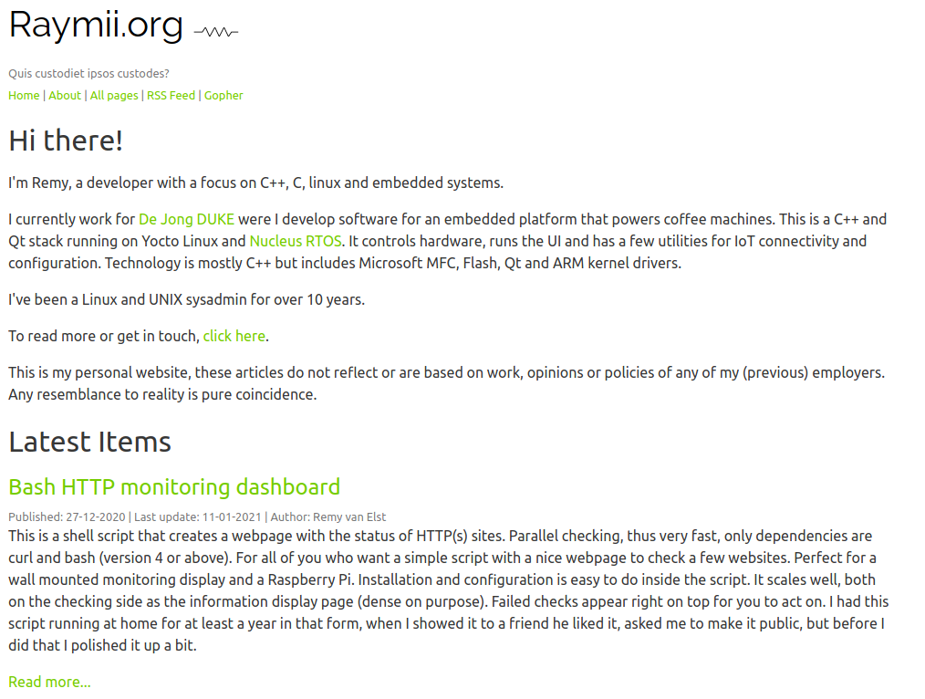
Most notably I've switched fonts, I'm now using Ubuntu instead of Raleway. One of the complaints I got often was the readability / contrast on the site and I do agree that Raleway was quite thin. I like the Ubuntu font as well and that is thicker, so I hope it provides better contrast. Please let me know!
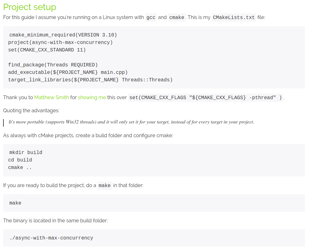
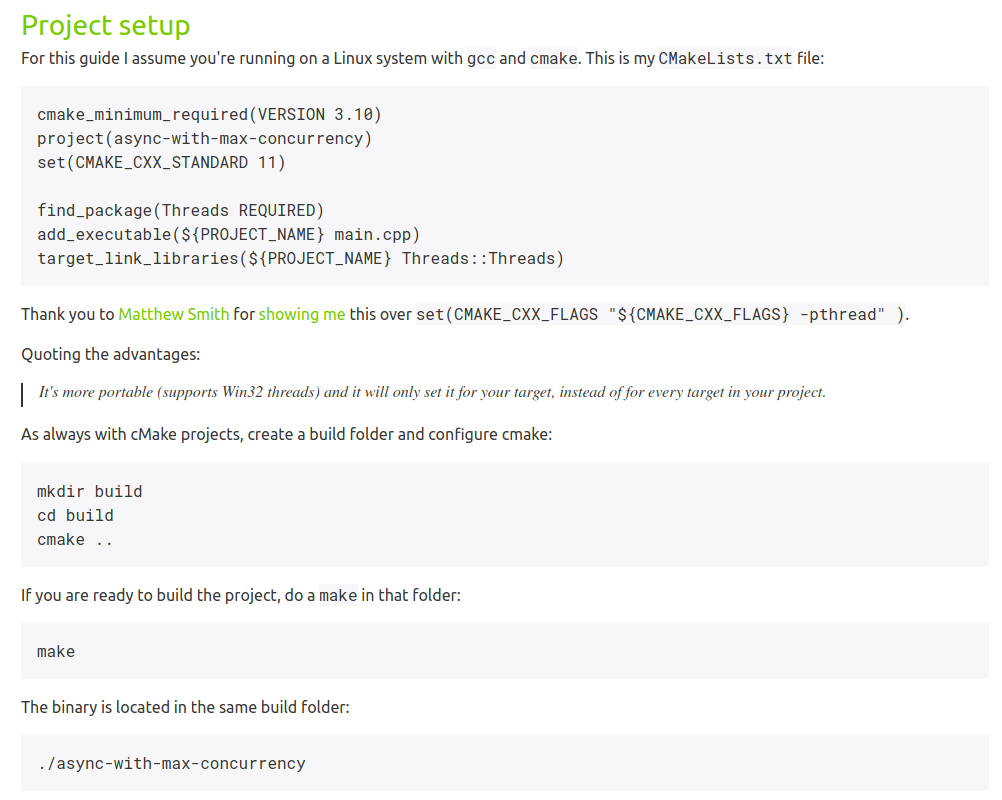
The code blocks are still monospace Roboto, since I like that font as well. One of the small CSS improvements is that the indentation on the first line of a code block is now gone.
The link to the Cluster Status page, which is a fancy live interactive monitor, is now added to the top as well. I had to scroll down way too often.
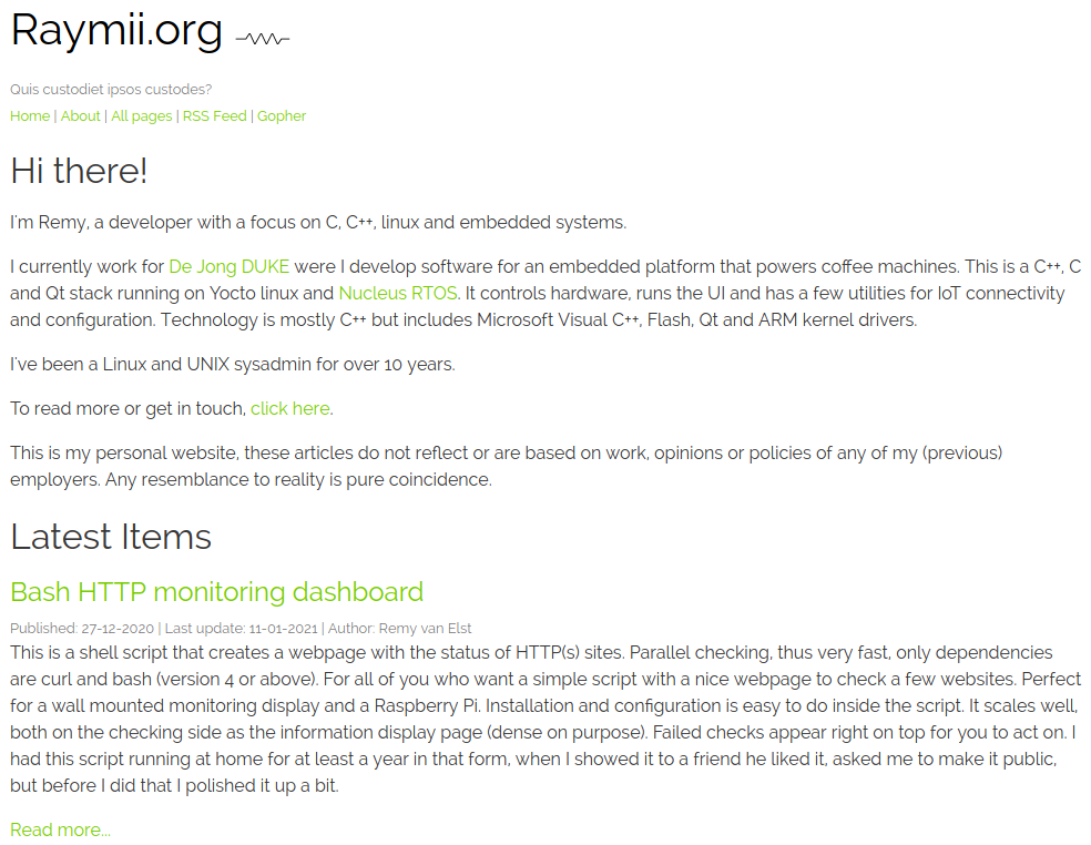
Screenshots, before and after
For your pleasure and archival purposes, here are a few screenshots detailing the changes.
The frontpage, before:

The frontpage, now:

An article section, before:

An article section, now:

Tags: blog , css , ingsoc , python , raymiiorg , server , site , theme