Raymii.org

אֶשָּׂא עֵינַי אֶל־הֶהָרִים מֵאַיִן יָבֹא עֶזְרִֽי׃Home | About | All pages | Cluster Status | RSS Feed
Site updates, new layout
Published: 08-05-2019 | Author: Remy van Elst | Text only version of this article
❗ This post is over six years old. It may no longer be up to date. Opinions may have changed.
Table of Contents
This site is generated with my self-written open source static site generator named ingsoc (named after 1984). I've updated the layout of the website to be less cluttered, allowing you to get to the content much faster.
Inspired by my recent gopher adventures I decided to do away with the 2 column layout (drop the sidebar with menu) and have a smaller header with essential links. On mobile this makes a huge difference in scrolling, on the desktop it looks less cluttered.
The Gopher site is just a list of articles with a nice header and a few links to the about page and other Gopherholes. I wanted to replicate that layout on the web site, but with a little bit of styling to make it look nicer than just plain text.
If you read these site update articles, please let me know. I'd like to hear your opinion on the new layout.
I sometimes write updates on new changes in ingsoc, those articles can be found
here. The last large layout update was over a year ago.
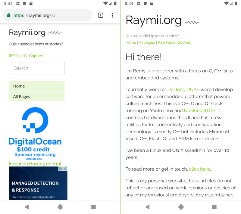
Mobile side by side
The previous layout was reasonably responsive, it scaled to smaller devices. The menu and sidebar appeared before the actual content on mobile, requiring you to scroll down quite a bit. The current layout has the content right there.
Desktop side by side
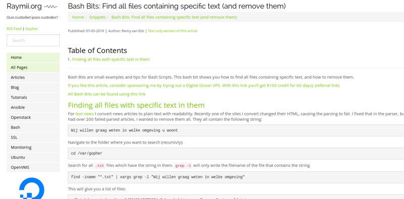
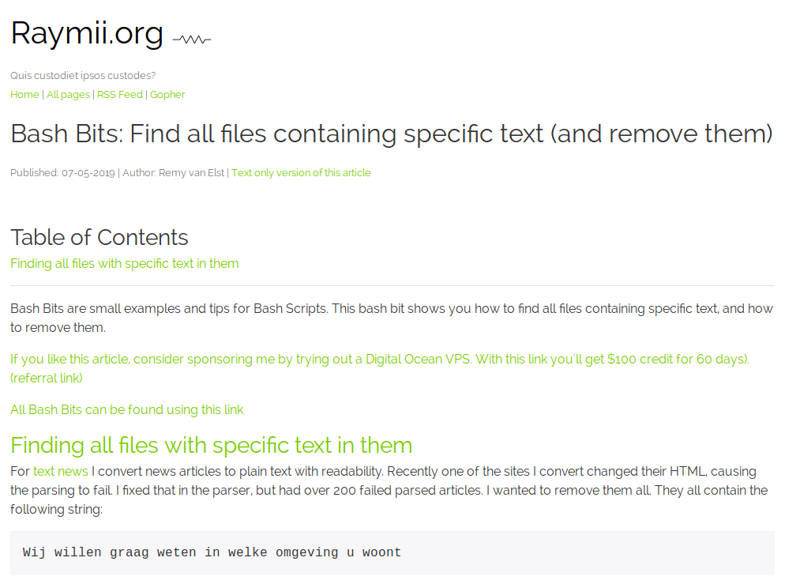
On the desktop the sidebar with the menu and sponsors has disappeared. It's now in the header. The sponsor image is replaced by text in the articles.
This was the previous layout:
This is the current layout:
Small improvements
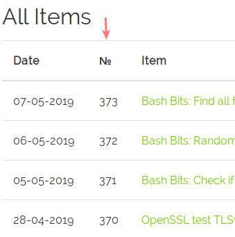
The overview page now has a count:
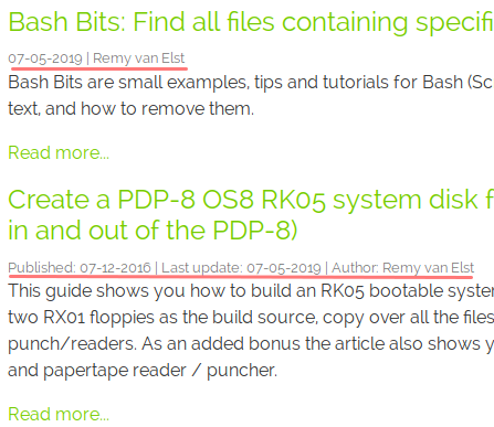
If an article is updated after publishing, this is now shown, both on the site as well as the RSS feed:
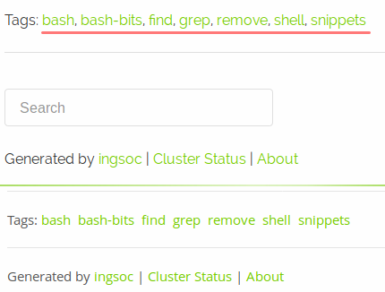
The tags for an item are now comma seperated and the search bar has moved down:
