Raymii.org

אֶשָּׂא עֵינַי אֶל־הֶהָרִים מֵאַיִן יָבֹא עֶזְרִֽי׃Home | About | All pages | Cluster Status | RSS Feed
Firefox 89 Proton UI Tab Styling
Published: 27-06-2021 | Author: Remy van Elst | Text only version of this article
❗ This post is over four years old. It may no longer be up to date. Opinions may have changed.
Table of Contents
Firefox 89 recently came out with a "new" user interface (named proton). I'm not a
fan of change because UX/UI people need to make it seem like their job is relevant.
Also, the picture they show under the headline "17 billion clicks..." only
scares the crap out of me, tracking every move a user makes in their browser seems
to me to be a bad idea, but hey, lets see how long Mozilla can continue their war
against their own users. Since the about:config flag to disable proton
will probably be gone in a few releases I thought, why not try to get used to
this new interface. It's so enormous and wide, lacking contrast. As you
might have guessed, I cannot get used to the tab bar, so in this post I'll show you
how to use the userChrome.css file to make the new tab bar look a bit more like
the old tab bar.
The changes we're going to make include:
- A brighter background colour for the active tab
- A bold font for the active tab
- A larger font size in the tab bar
- The tabs are connected to the browser again, instead of floating in an empty void
- The tab you are hovering over is colour brighter
- The tab bar height is reduced (compact mode)
Below you'll also find before and after screenshots.
Before and after screenshots
Here is the default look showing the tab bar of firefox 89:

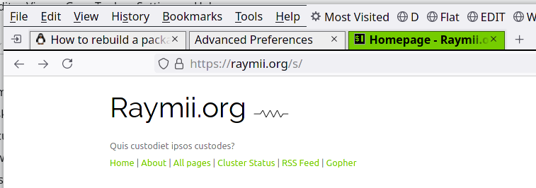
This is the tab bar after we've made and activated the userChrome.css file:

And this is the tab bar with browser.proton.disabled set to true, to temporary
disable the new proton interface:

As you can see I have customized my browser window toolbar layout to be more compact than the default settings. The menubar is enabled (in the title bar) and the bookmark bar is next to the menu bar (thus the wasted space below the tab bar is moved to otherwise empty space next to the menubar). These new tabs are a huge waste of precious screen real-estate.
Set up a userChrome.css file
I assume you use Linux, for Windows / OS X the instructions are comparable, but the path to the profile folder is different.
Navigate to about:config, search for the setting toolkit.legacyUserProfileCustomizations.stylesheets
and enable it (true). If you want to set the UI density to Compact, you can change
browser.uidensity to 1. My stylesheet also does that for just the tab bar.
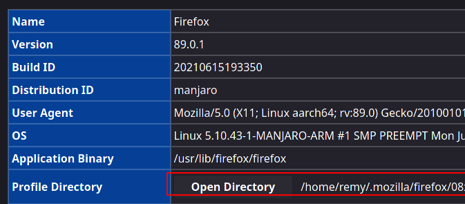
Next, under the Help menu, open up More troubleshooting information. There
you'll find the path to your profile folder and a button to open it right away.

Either click the button or navigate to the folder in your terminal. In the main profile
folder, create a new folder named chrome (all lowercase):
mkdir chrome
Navigate into that folder and create a file named userChrome.css, open it up in your
favorite text editor:
vi userChrome.css
Here is my userChrome.css file. Paste in in, change the colours to your liking and restart
the browser to see the changes.
tab {
    font-size: 16px !important;
    font-family: sans-serif !important;
}

.tab-background {
    background: #eeeeee;
    border-radius: 0 !important;
    margin-bottom: 0px !important;
    box-shadow: 0 0 2px 2px rgba(0,0,0,0.1) !important;
    border: 1px solid rgba(0,0,0,.5) !important;
    border-bottom-width: 0px !important;
}

#tabbrowser-tabs {
    --tab-min-height: 24px !important;
}
#scrollbutton-up,
#scrollbutton-down {
    border-top-width: 0 !important;
    border-bottom-width: 0 !important;
}

.tabbrowser-tab[selected] .tab-background {
    background: #75cc00 !important;
}

.tabbrowser-tab[selected] .tab-label {
    color: black !important;
    font-weight: bold !important;
}

#TabsToolbar {
    border-bottom: 2px solid #000000 !important;
}

.tabbrowser-tab:hover .tab-background:not([selected]) {
    background: #75cc00 !important;
}
Most of the CSS came from this article, customized to my liking (no rounded corners or fancy purple/yellow colours). Also the tab bar height was added.
How do you find out that you need to use those specific class names? If you
want to tweak the UI further, you can inspect the Firefox UI via the Browser Toolbox
(You can enable it in the Developer Tools settings and then press
Ctrl+Alt+Shift+I). (Thank you to gillescastel on Lobste.rs).